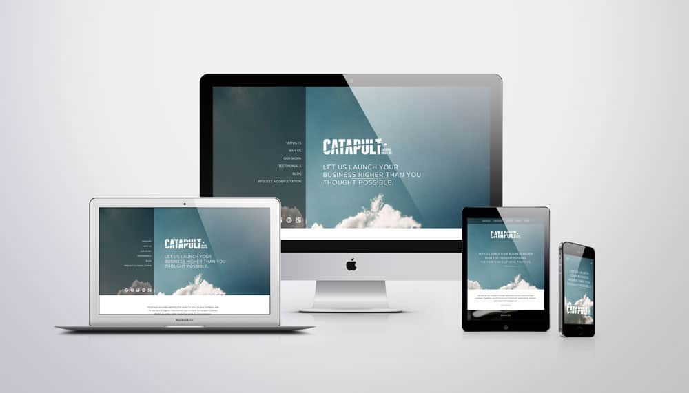
Optimize Your Site to Retain More Customers with Responsive Design
Responsive website design simply means that all of the information on the website – the content, the buttons and the images – is structured, by pixel, to fit nice and neat on any device. This gives your consumers exactly what they want in an easily-digestible format.
Responsive design allows your website to serve all of its users, whether they need to read more information, or they just need a call to action and a phone number. It also gives you the confidence that your website is representing your company at its best, no matter how customers are viewing it. By providing the best user experience across all devices, you can keep your customers happy and increase your website conversion rates.
This is Why You Need Responsive Design
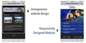
Which site makes you want to learn more or make a purchase, and which one gives you a headache?
The key to responsive design is usability. Once on your site, customers will try to find what they need for about 10, maybe 15, seconds before they give up and go somewhere else, according to the Neilsen Norman Group.
Responsive design catches your audience’s attention fast, with just the information they need, depending on the device they’re using. If you customer is searching for you on a phone, they’ll get frustrated by long blocks of text and small, hard-to-read buttons.
But if they’re searching for you on a tablet or computer, they don’t mind reading more about your company and products. Don’t get me wrong, you ALWAYS need to design a clear, easy path your customer can follow to view your products or contact you, but on computers and tablets you have more room and more functionality to play with.
Every device has a purpose. Desktops are for full experience viewing and in-depth browsing. Tablets are best for portable, in-depth browsing, and mobile sites are for immediate, need-to-know-now searches. Make your ONE site serve all of these purposes with a responsively-designed website.
To Recap, Responsive Design:
- Looks better, which makes your company and your products look better
- Saves you money, time and trouble developing a separate mobile and tablet-friendly website
- Helps you capture the 30 percent of your audience that finds you on their mobile devices
Great responsive design takes into account that people in line at the grocery store looking up your site “real quick” DO NOT want to read the three awesome intro paragraphs that you have on your desktop site. They most likely have an immediate question and need assistance, so give it to them! Make it easy for your customers to get what they need, and they’ll reward you with their business.
—————————————————————————————————————————————————————
Anne LaPlante is a copywriter at Catapult Creative Media. A graduate of LSU with a degree in advertising, she spends most of her free time posting pictures of her dogs and cats to Instagram.
Work with Catapult Creative Media Inc.
Catapult Creative Media Inc. is a digital marketing and design agency serving south Louisiana and headquartered in Baton Rouge. Founded in 2007, Catapult provides digital, social and mobile marketing solutions backed by relevant strategy and measurable results. Catapult works the web to their clients’ advantage, launching them to their next level of success.


