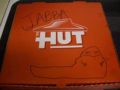
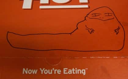
Company meetings are usually accompanied by food of some sort. At our latest, we got pizza! Pizza Hut to be exact. So, when our pie of cheesy goodness arrived, we were slightly surprised to find the box emblazoned with a new company look – “The Hut”. Maybe it has been around for a bit, and we just haven’t had Pizza Hut in a while. Maybe its part of a growing trend for older companies to “minimize and modernize” their logo (think Circuit City’s “The City”). Whatever it is, we immediately burst into laughter and picked up that Sharpie.

While I think it is great that companies try to stay on top of their corporate image, all I’m asking is for graphic designers to “artist-proof” their images. When going for a modern look and following trendy design techniques, try to think about all the different ways that your logo can be perceived. This usually doesn’t happen overnight and rarely ever with one person. Think about the media jumbotron that is Coca-cola. They have invested billions (with a “B”) in honing their corporate image. While not all of us have billions to spend on marketing and development, we can implement good design. There are four elements that can be seen in every great logo:
- It’s describable
- It’s memorable
- It’s effective without color
- It’s scalable i.e. effective when just an inch in size
So, for all the businesses out there that either need a logo, or need an updated look, consider these elements when you choose a designer. A strong logo is worth its weight in gold. A slightly weaker logo is worth its weight in giggles and does nothing to help your business stand out. With that….back to Jabba.


