Don’t Let Your Company Logo Be a Total Fail
Have you heard this one? How do you know if someone is a graphic designer? Don’t worry, they’ll tell you. It’s meant to be a joke (really, you can fill in with anyone – lawyer and vegan are my favs) but the kernel of truth is you’re more likely to get feedback from a designer.
Fact: we are trained with critiques to improve our trade, they’re part of our daily design lives and we’ve had to develop a thick skin for it.
So, naturally, when people ask us “what do we think” when it comes to their logo, we’ll have something to say. This article is meant to share a few pitfalls we’ve had to learn the hard way. It is not meant to say what a good logo is or isn’t, just some common traps you should avoid to prevent ultimate logo fail.
It could even save valuable time and money if you are in the market for a designer by giving you things to look for in their portfolio of work. At the very least, it will make your life easier when dealing with a graphic designer.
Rule #1: Use the right tools for the job.
Your logo needs to be able to scale, from very small to “we need this on a billboard”. The logo should be built as a vector file, meaning a file that doesn’t lose its quality when you modify its size. Otherwise, your logo will blur any time you try to resize it for different uses. Use Adobe Illustrator, and save it as an .ai or .eps file and another copy as a PDF to send to vendors.
Rule #2: Pass the one color test.
Wouldn’t it be nice to have some koozies or swag for your business? Chances are, you’re gonna need a one color logo. Let me take a step back. I’m not implying that all logos need only be one color, and clearly there are imprinting options beyond one color, but the one color test is about how the logo’s overall shape and colors interact and if they allow it to stand alone.
For example:  Looks great right? Now let’s see it on a black background, as one color.
  Hmm. The danger here comes from forcing the colors to carry the brand on their own.
When this happens, you lose a huge identifier of your brand. So, what to do? At this point, you’re either looking at a more expensive imprinting option, removing a chunk of your logo or substituting an element that isn’t even part of your brand.
Business owners: make sure your logo stands up to this basic test.
Rule #3: No Clip Art. Ever. No Comic Sans either.
Just don’t.
Rule #4: Size matters. Really.
Your logo is going to be the face of your company and it is going to get a lot of use. Consider: your website, business cards, signs, shirts, billboards, social media sites and TV all have different size restrictions. The best way to control your consistency and message is to plan out ahead of time how the logo will be used across a variety of platforms.
Rule #5: Pay attention to the details
Specifically: font choices (1-2 max) and kerning (the space between letters). Find the happy medium so that people can read your company’s name and message easily. A word of caution: if letters are too close or too far, you could say something entirely different.
Rule #6: Pay attention to what you DON’T see. It’s called white space.
It’s the negative shape that is created within your logo – kind of like an optical illusion. We jokingly refer to it as the ‘Boob Test’. If you look at the negative space in your logo – is there anything that you didn’t notice before? Specifically how the negative spaces join together?
Do they create a reverse logo that shows an unintended shape?
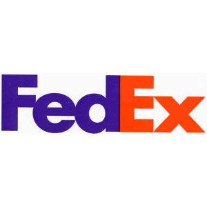
Good example. Notice the arrow.

Bottom line: once something is seen, it can’t be unseen and it will always be that logo. So, think dirty and make sure there is nothing representing male or female naughty bits.
Oh, and get a second and third opinion. We live in a world where everything around us, every single day, is designed. Most of the time, we take it for granted and only notice it when it goes sideways. But, the relationship between a logo and company is unbreakable and critical.
You don’t want to risk your professional brand on some overlooked mistakes. Often, a professional can repair these problems, but they will cost you more in the long run. So, do it right from the start – use the right tools, test for the worst-case one color, skip the lazy design, pay attention to the details and pay attention to what your logo says about you.
Bonus Pro Tip: Be consistent – both internally to the company and with 3rd parties. How do you ensure consistency?
It’s called a branding guide. It’s a helpful little style guide that tells people how to and how not to use your logo. At minimum it covers primary and secondary fonts that can be used with the logo, color blocks with the PMS colors, RGB, CMYK and hex codes (these are color codes for printing and web) for the color scheme and instructions for vertical and horizontal uses of the logo.
This is important for consistency in your branding. It might not sound like much, but when different people use your logo in different ways, it can get crazy out of hand unless they have rules to follow.
Check out Mail Chimp’s Online guide for 3rd party users. Dropbox has a nice one as well, especially the Spacing Considerations.
Virginia Huling is Creative Director at Catapult Creative Media Inc. She enjoys drawing, animation and can often be found playing video games. Also, cats.
Work with Catapult Creative Media Inc. Catapult Creative Media Inc. is a digital marketing and design agency serving south Louisiana and headquartered in Baton Rouge. Founded in 2007, Catapult provides digital, social and mobile marketing solutions backed by relevant strategy and measurable results. Catapult works the web to their clients’ advantage, launching them to their next level of success.


I never think of the second tip. The logo does get lost when you change to a color background. Not everything get printed in color. I like the black and white test. That’s the one I use often.